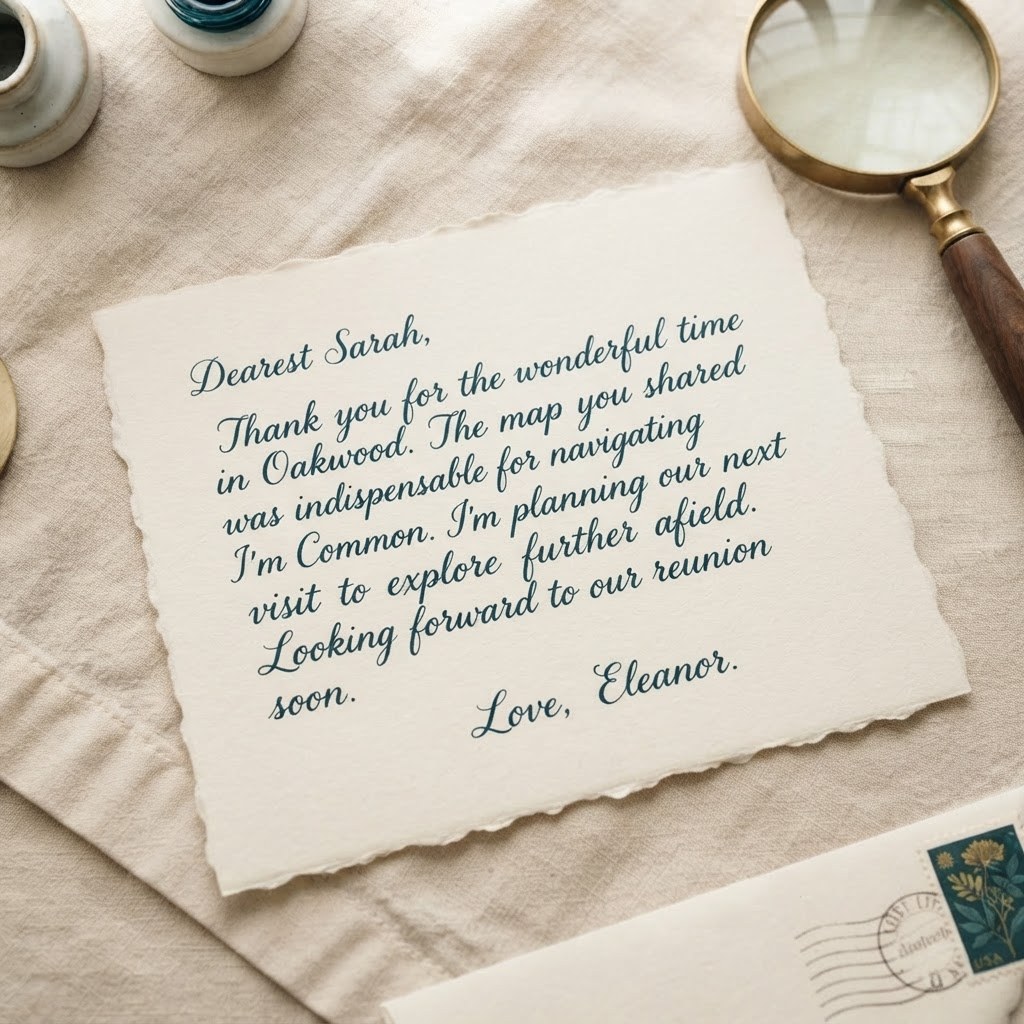
You hand someone a handwritten note, and their eyes light up immediately. But then a quiet worry creeps in: what if my penmanship looks like a doctor’s fast prescription? Or what if a direct outreach campaign turns into messy, unreadable scribbles? Maintaining strong handwriting legibility is essential when you want your business mail to impress recipients and communicate clearly.
Good handwriting legibility is not about mechanical, rigid perfection. It is about warm human penmanship combined with clean, readable letterforms. When a prospective client opens your envelope, they want to read a message that feels personal, thoughtful, and effortless to follow from beginning to end.
At Real Ink Letters, we write every message using physical writing machines that hold real ballpoint pens on premium paper. Every stroke reflects genuine human handwriting without sacrificing clarity or precision. Here is how clean penmanship protects your response rates and ensures your prospective clients read every word you write.
Why clean penmanship protects your response rates
People open handwritten letters because physical mail feels personal and authentic. In fact, 98% of handwritten letters get opened because they stand out immediately from printed bill statements and gloss circulars. But getting your letter opened is only the first step in building a relationship.
If the message inside requires a magnifying glass or a codebreaker to decipher, your recipient will set it aside. Clean baseline alignment, proper spacing between words, and crisp ink flow keep your reader engaged. Readable penmanship respects the recipient’s time while preserving the distinct warmth of a real letter.
When handwriting legibility is clear, your message conveys quiet confidence. Readers absorb your points naturally rather than straining over poorly formed letters. That comfort translates directly into higher engagement and better conversation rates for your business outreach.
How we maintain letter clarity at scale
Writing one hundred thank-you notes or outreach letters by hand can leave your wrist cramped and your handwriting degrading by letter twenty. Human fatigue inevitably leads to slanting lines, uneven margins, and illegible ink strokes that undermine your professional image.
While human hands tire, simple printing plotters often drag ink or create stiff, unconvincing letters. We fine-tune ink pressure, line spacing, and stroke variation so each letter looks authentically human yet remaining crisp and readable. You get genuine ballpoint pressure indentation on heavy paper stock, ensuring every sentence is legible across entire mailings.
To see how our physical pen process handles letter formatting and paper choices, learn more about how it works on our detailed process page.
Key standards for readable handwritten mail
Whether you choose to write letters yourself or partner with a specialized service, specific structural standards determine overall readability:
- Balanced line spacing: Adequate vertical space prevents descenders on letters like g and y from tangling with uppercase letters below.
- Consistent ink flow: Real ballpoint ink creates subtle natural weight variations without heavy blotches, smudges, or faded spots.
- Generous margins: Clean left and right margins keep the text block visually inviting and easy for busy people to scan.
- Simple sentence structure: Short paragraphs and plain English keep your core message moving forward smoothly.
Following these simple layout standards ensures that prospective clients digest your message in seconds. Clear visual structure combined with authentic penmanship turns cold outreach into warm conversations.
Testing legibility before you send
A simple test will confirm whether your letter copy is ready for production. Place a handwritten sample on a desk under normal room lighting and step back two feet. If a teammate can read your opening lines comfortably without leaning in, your prospective clients will read it easily at their kitchen table.
Clear communication coupled with real blue ink builds trust far faster than any glossy brochure or printed sales flyer ever could. When recipients can read your message effortlessly, your response rates reflect that clarity.
Ready to launch a clear and effective direct mail campaign? Visit our online shop to select your letter style and start reaching your target audience today.
Leave a Reply